Client
TravelMaker Group
TravelMaker Group
What I delivered
Visual Identity
UX/UI
Visual Identity
UX/UI
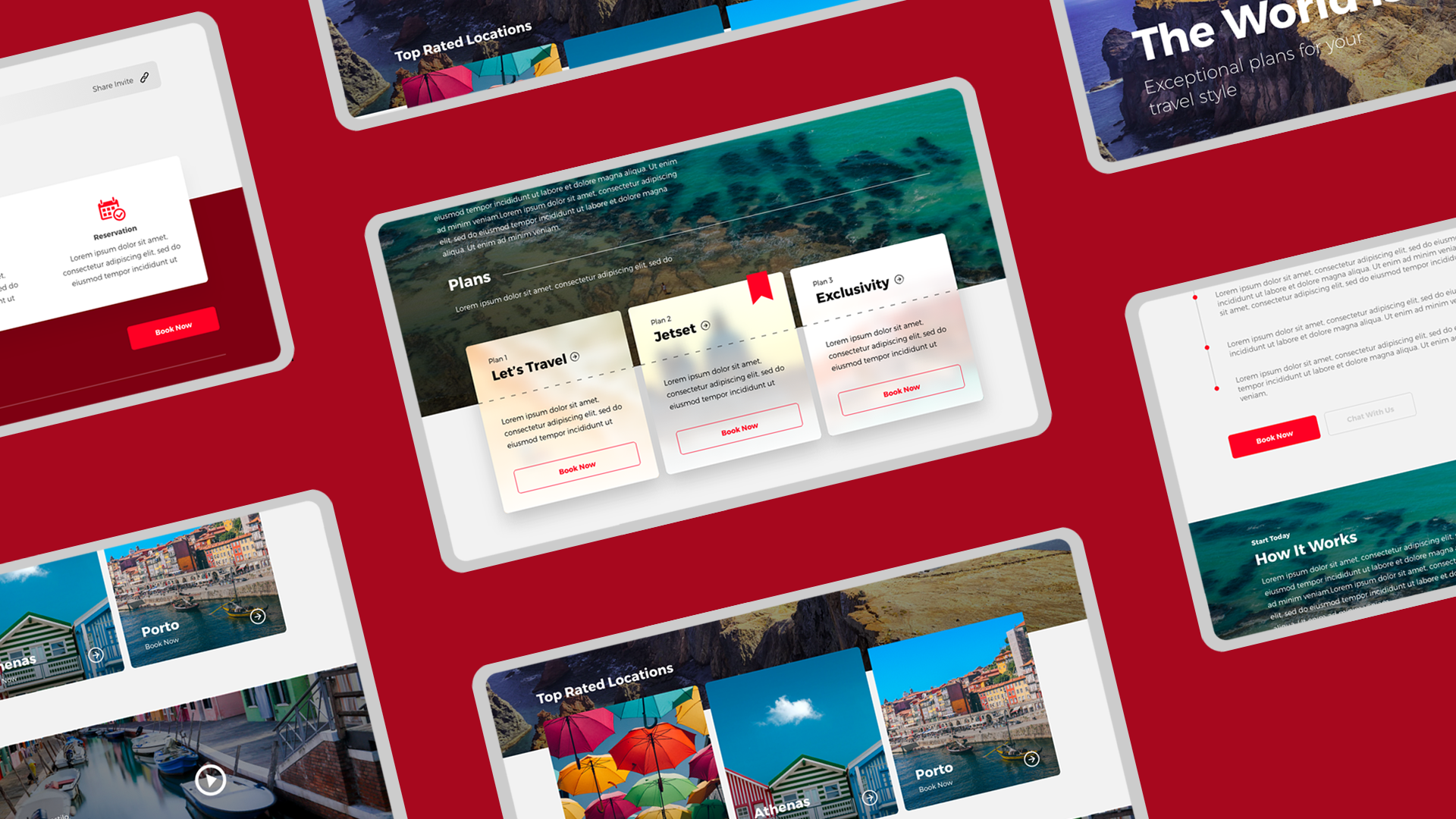
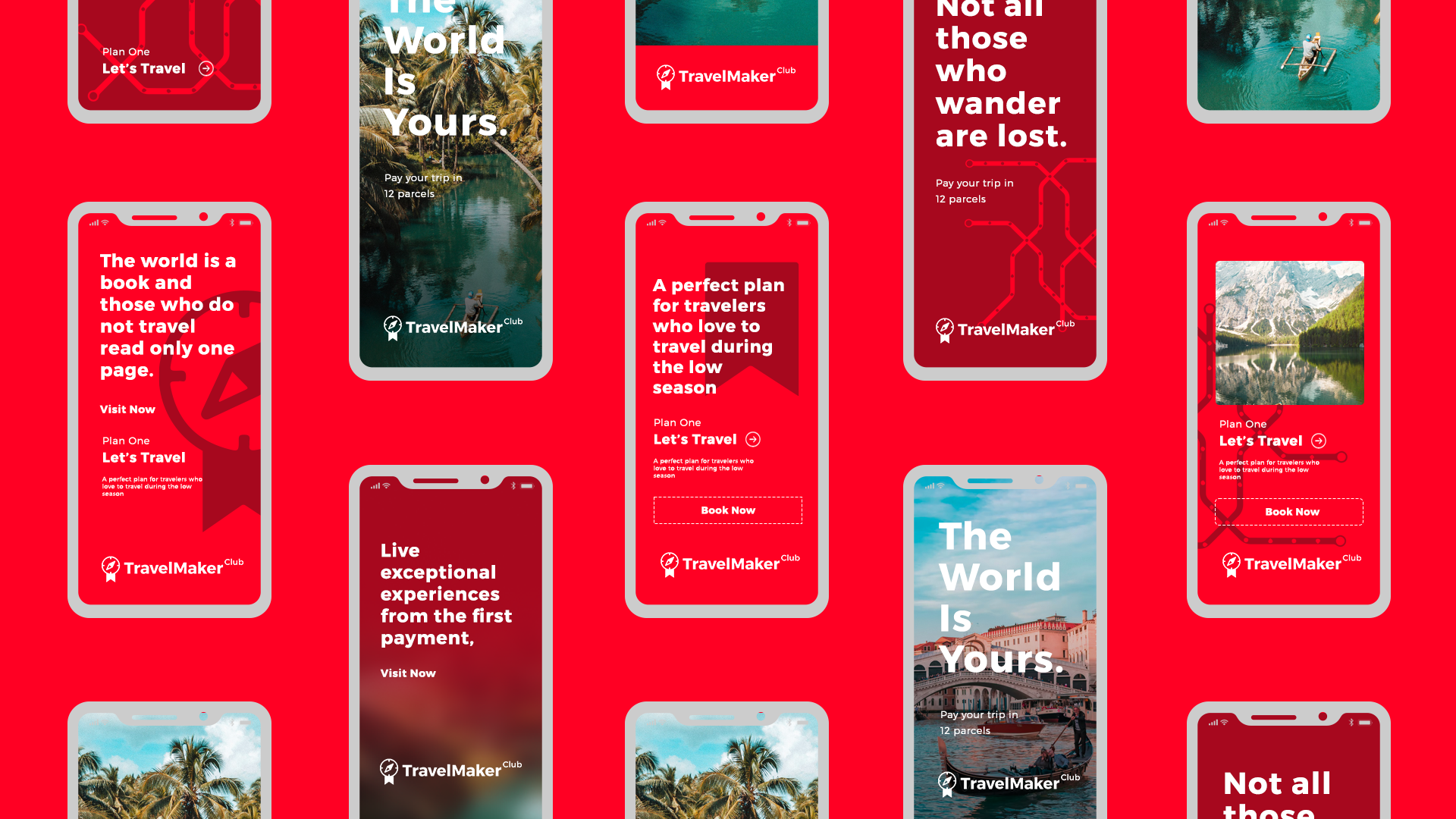
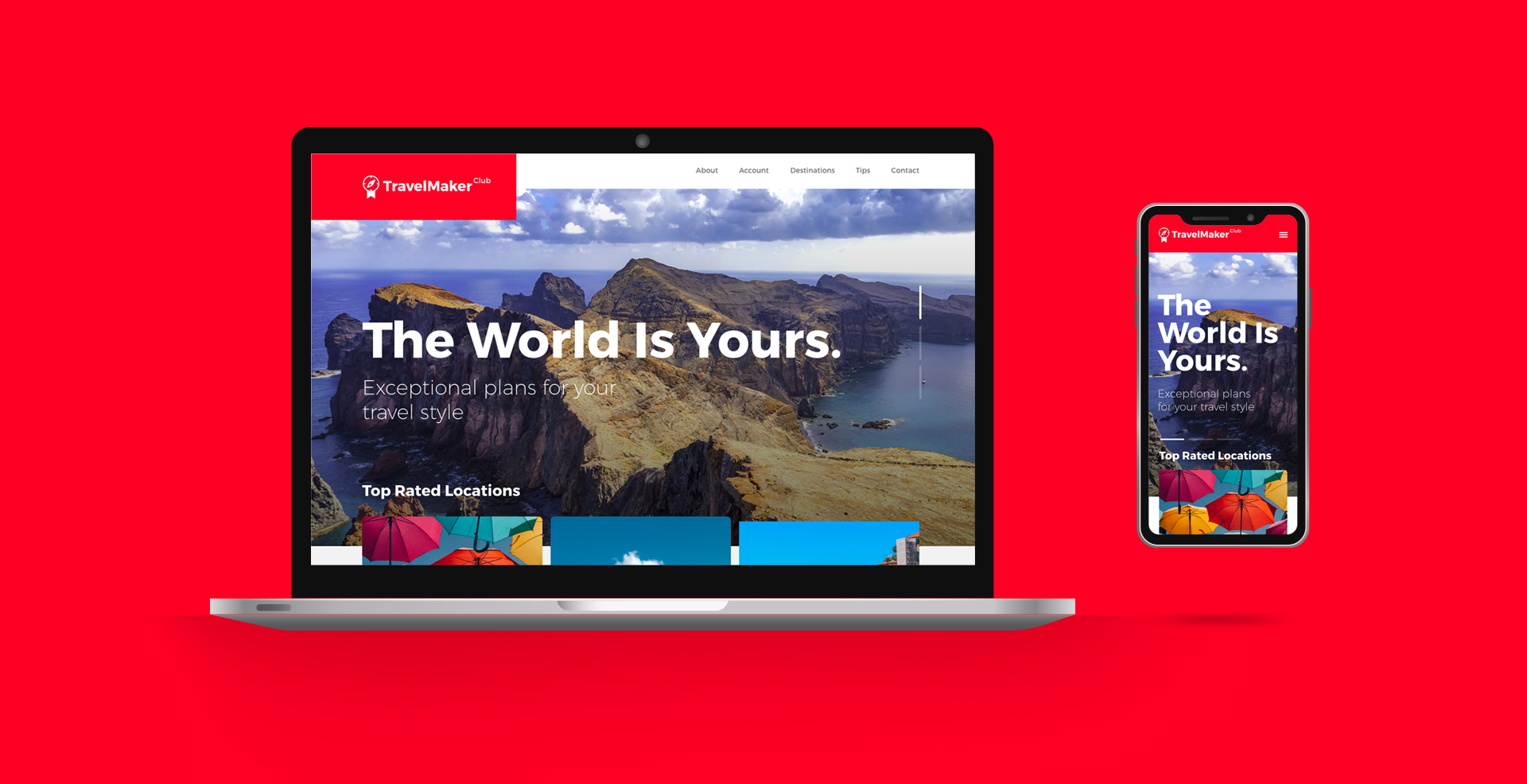
TravelMaker Club is a platform where you can easily and safely, book your trips while earning points to travel.
The company was looking for help to structure its brand in order to strengthen its identity for the startup's expected growth. Based on the project's strategies, the identity is directly related to a brand that "breathes the culture of traveling",


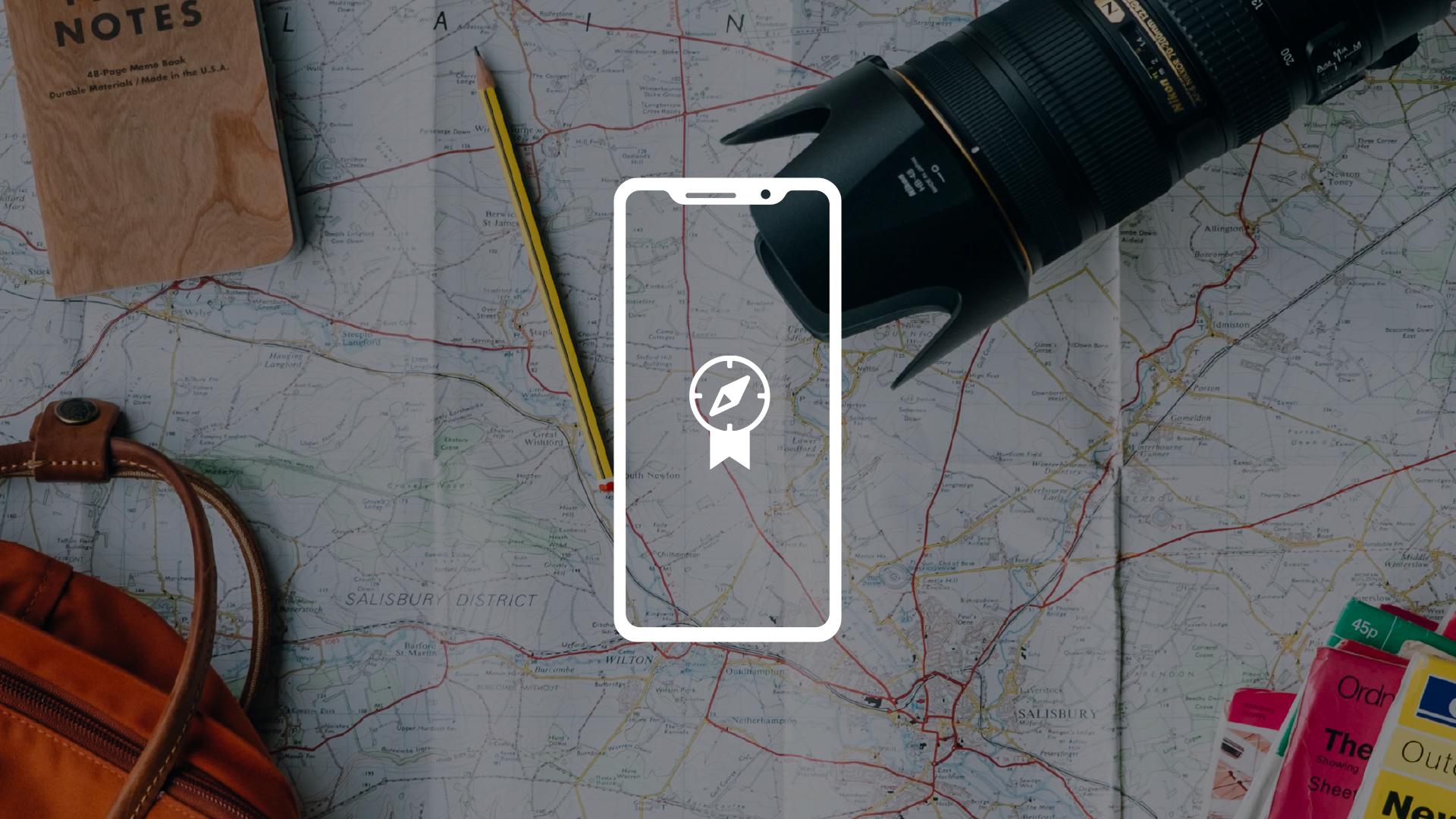
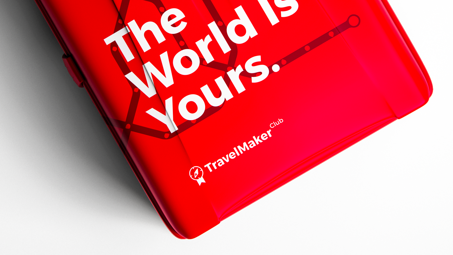
Discover the Club
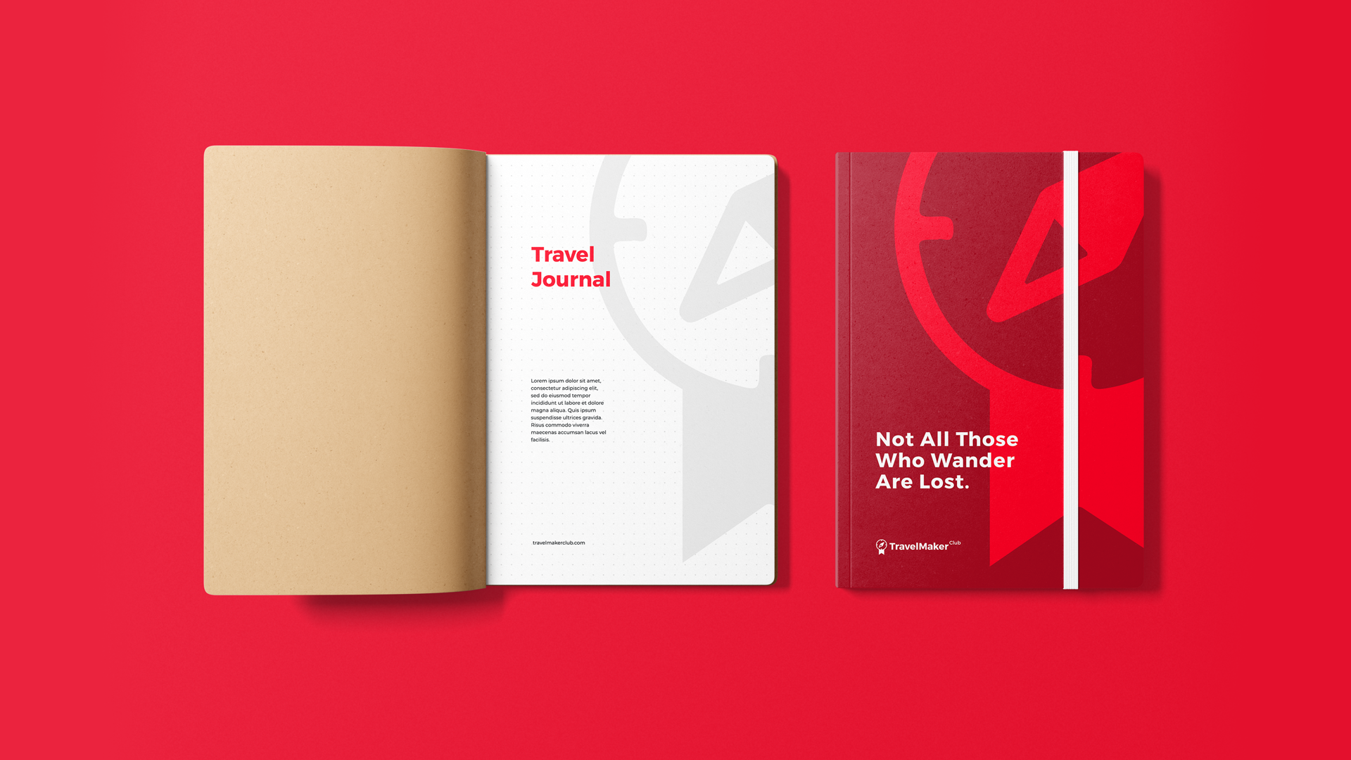
The compass represents discovery, traveling, and freedom, while the banner illustrates the club and community side of the brand.
Red attracts the most attention and is associated with strong emotions, such as love and passion. It's the universal color to signify strength, power, and courage. Red is vibrant, stimulating, and exciting with a strong link to Neophilism.
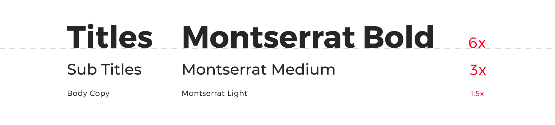
The Sans serif typography reflects a modern, and strong mood.
It makes the logo easily recognizable and readable.
It makes the logo easily recognizable and readable.
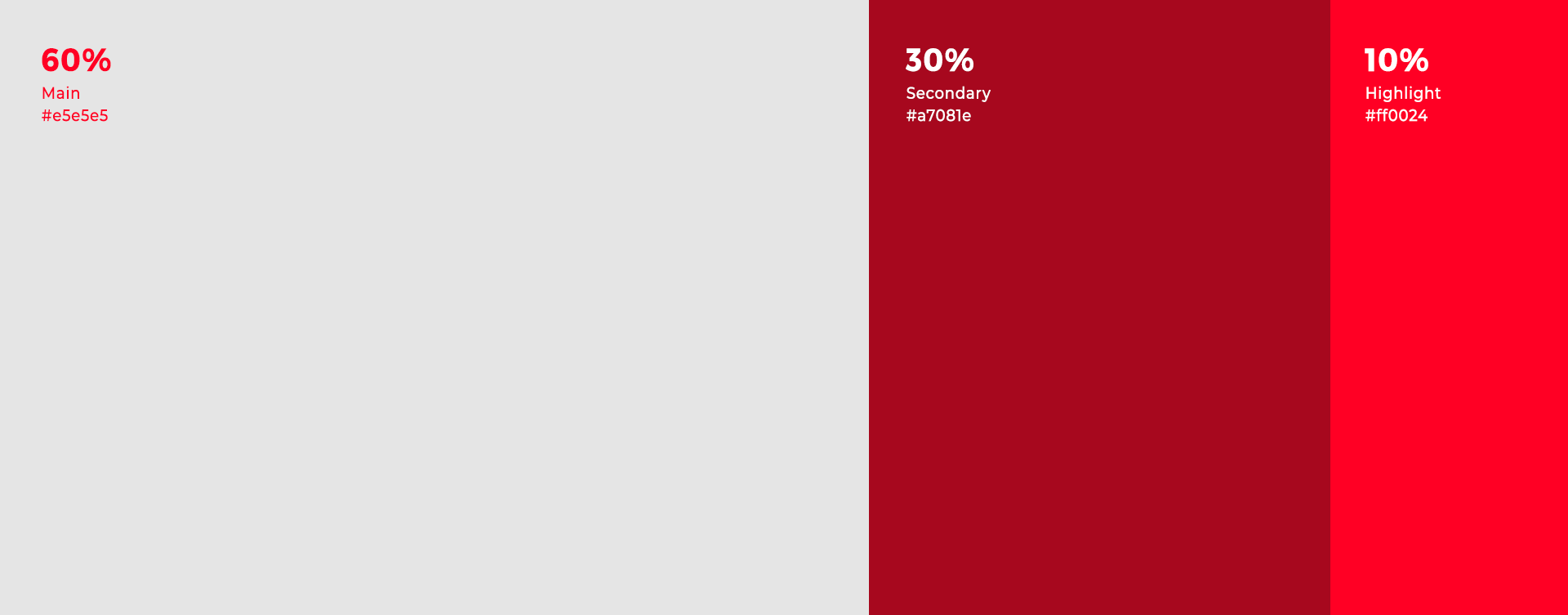
Colour Palette
The 60-30-10 rule refers to an ideal proportion that is meant to reach a balance among colors.
60% is the dominant color (Grey), 30% is the secondary color (Wine Red), and 10% is for accent color (Travel Red).
This formula allows the eyes to move comfortably from one point to the next.
The main font of the brand is Montserrat Bold.
To get the right visual contrast, a good rule of thumb is to always double or halve the font's point size
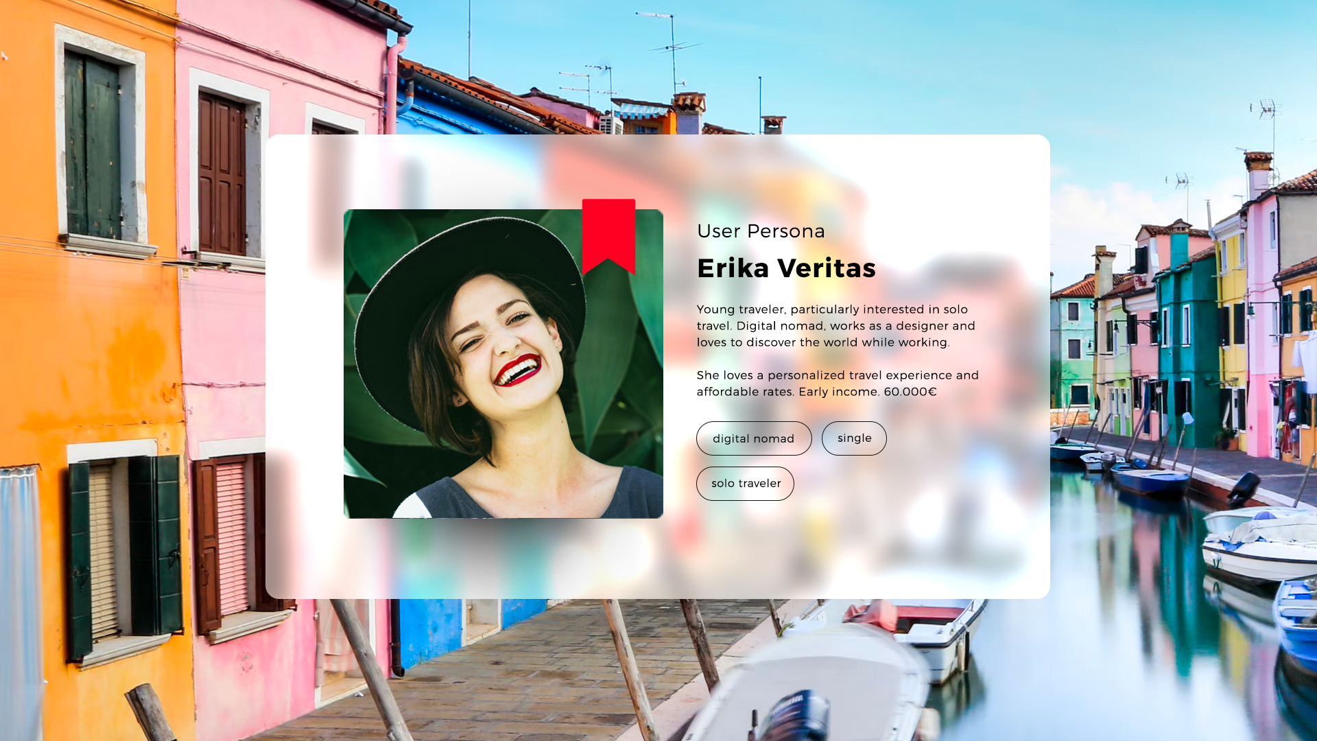
USER NEEDS
"Erika, a young traveler, digital nomad designer, needs a reliable and affordable platform, to book and manage her trips."